

OVERVIEW
Through my research, I discovered that many people seeking mental health support also experience physical symptoms - headaches, digestive issues, or chronic pain - but existing therapy platforms treat these separately.
I designed Wellnest to bridge this gap by creating an integrated platform that addresses both mental and physical wellness. The design focuses on reducing overwhelm through a calming interface and streamlined user experience.
Project Type: Conceptual MVP
Role: User Research, UX/UI, Branding
Tools: Figma
Timeline: 6 weeks for MVP design
PROJECT NAVIGATION
CHALLENGES
People looking for therapy often face a frustrating reality: they're dealing with both mental health challenges and physical symptoms, but have to seek help from different providers who don't communicate with each other.
Take someone like Olivia, a working mom managing anxiety and depression while also experiencing unexplained headaches and fatigue. She's already overwhelmed, and now she has to coordinate between multiple appointments and explain her full situation repeatedly. This scattered approach often makes people feel more stressed, not less.
RESEARCH INSIGHTS
My research confirmed what I suspected. People want mental health support that considers their whole experience. I spoke with busy parents looking for therapy options beyond medication, and first-time therapy seekers who felt overwhelmed by both the stigma and the confusing process of finding the right therapist.
Through interviews and surveys, six key needs emerged:

Holistic Integration of Mental and Physical Health

Convenience and Simplified Access to Care

Calming & Stress-Free Experience

Supportive Connection with Therapists

Transparent and Personalized Therapist Matching

Comprehensive
Overview of
Well-Being
When I organized all the interview insights, three main themes stood out:
People wanted clarity in their options, convenience in accessing care, and an experience that felt comprehensive rather than fragmented. This led me to prioritize features like detailed therapist profiles and easy health data integration. I also researched how design can impact stress levels and found that calming visual elements - like muted colors and gentle transitions - actually help reduce anxiety, which became central to my design approach.

To make sure I was organizing the app in a way that made sense to users, I sent a follow-up survey to the people I had interviewed. Their responses helped me create a visual map showing how they expected to find and group different features, which guided how I structured the app's navigation and content.
SYNTHESIS & APPROACH
Since so many people mentioned wanting their physical and mental health connected, I initially explored having primary care doctors work directly with therapists through the platform. This would have been ideal - less coordination hassle for users and truly integrated care.
But after weighing the pros and cons with a SWOT analysis, I realized this was too complex for an MVP. Instead, I focused on letting users connect their existing health apps (like Apple Health) to share data with their therapists, and added an AI chatbot to make finding the right therapist feel more supportive and less overwhelming.
USER FLOW
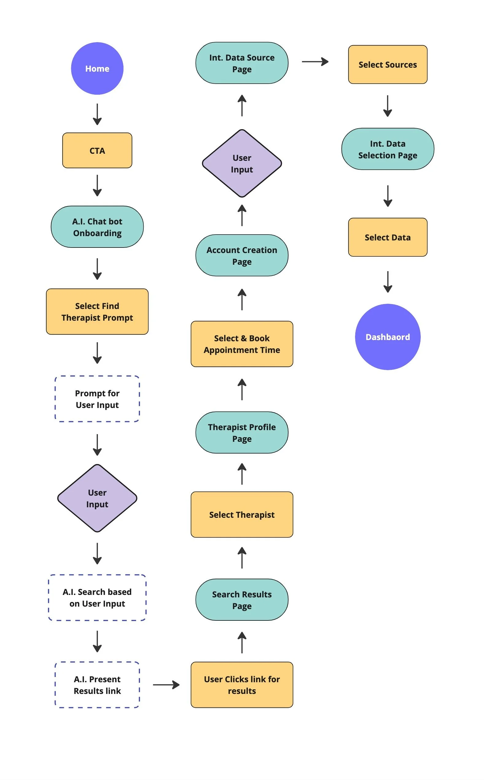
I mapped out how users would move through the app, from signing up to booking their first session. The flow I designed focuses on four key areas:
Conversational onboarding - Instead of filling out forms, users chat with an AI assistant that helps them explain what they're looking for in a therapist
Smart matching - The chatbot asks follow-up questions and shows relevant therapist options based on what users share
Health data connection - Users can optionally link apps like Apple Health or MyFitnessPal to give their therapist more context about their overall wellness
Streamlined booking - Clear steps from browsing therapists to scheduling, without unnecessary complexity
FEATURES & WIREFRAMES
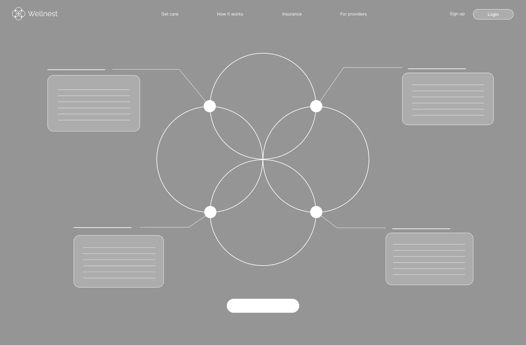
Landing Page & Value Proposition
Once I had a clear direction from my research, I knew exactly how I wanted the landing page to feel.
The goal was to immediately communicate that this isn't just another therapy app - it's a space that understands the connection between mental and physical health. I wanted users to feel calm and understood before they even started exploring. (I'll explain the logo concept in detail in the branding section.)

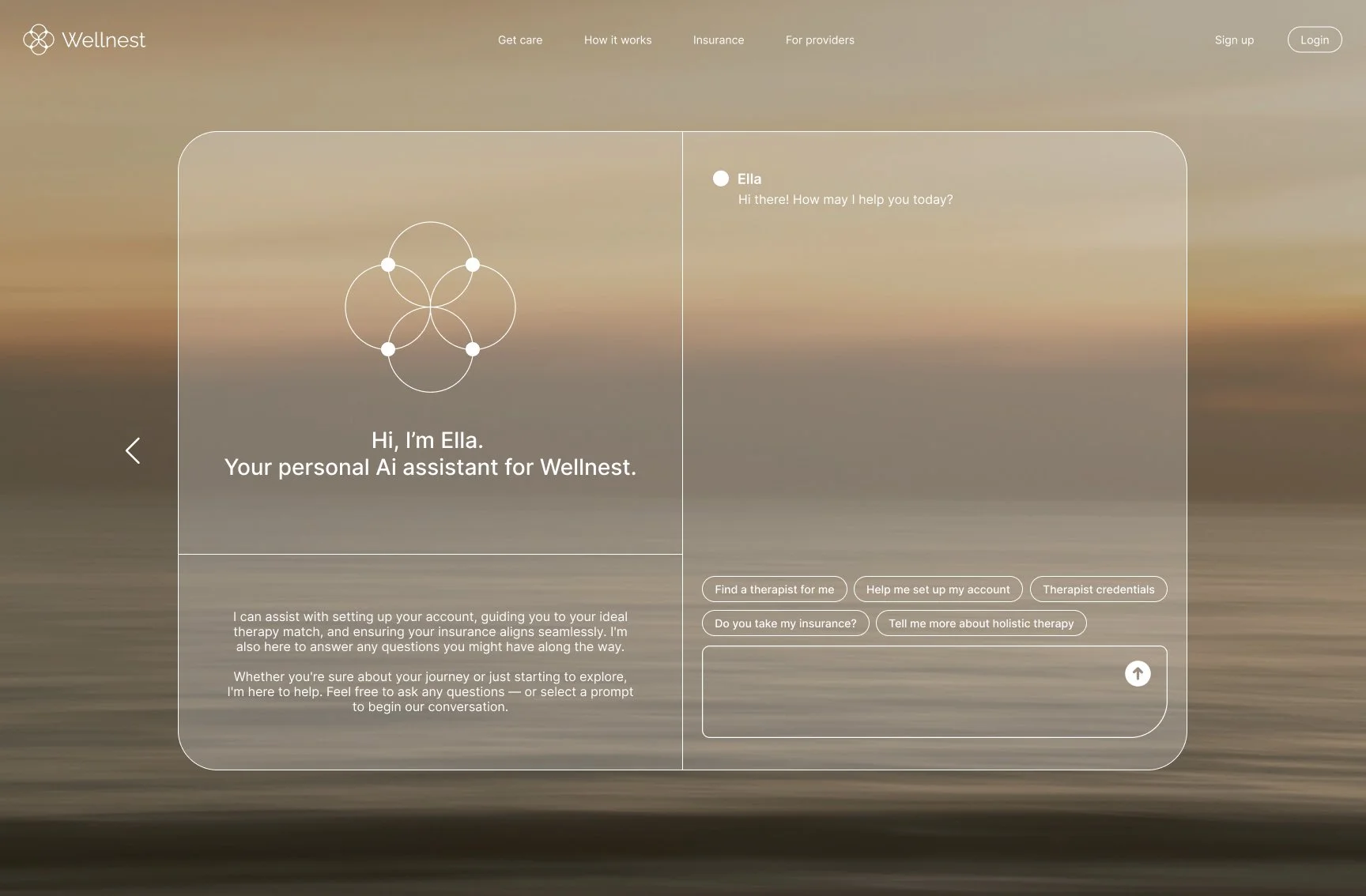
AI Chatbot Onboarding
Instead of making users fill out long forms right away, I designed a chatbot that feels more like talking to a helpful friend. Users can explain what brought them to therapy and what they're hoping to find, and the AI responds with follow-up questions or suggestions. It can offer encouragement, ask for clarification, or start showing therapist matches based on what users share.
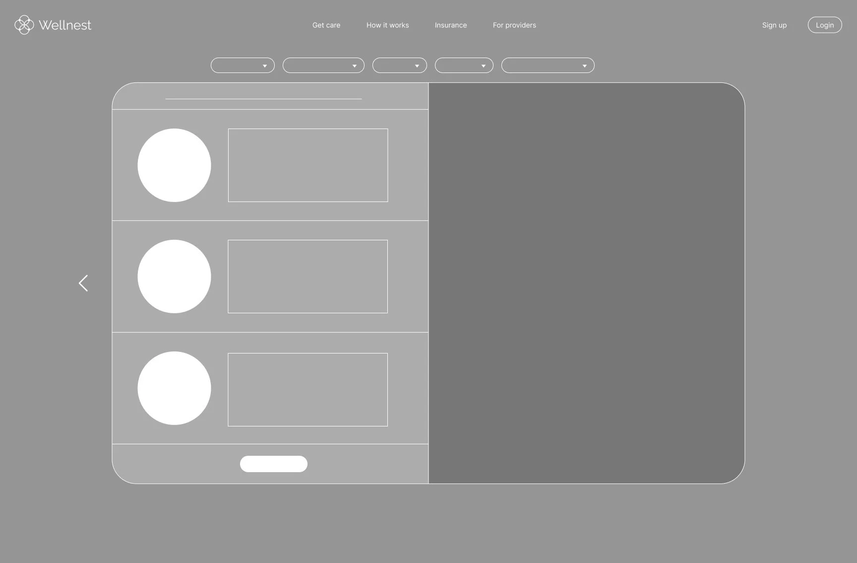
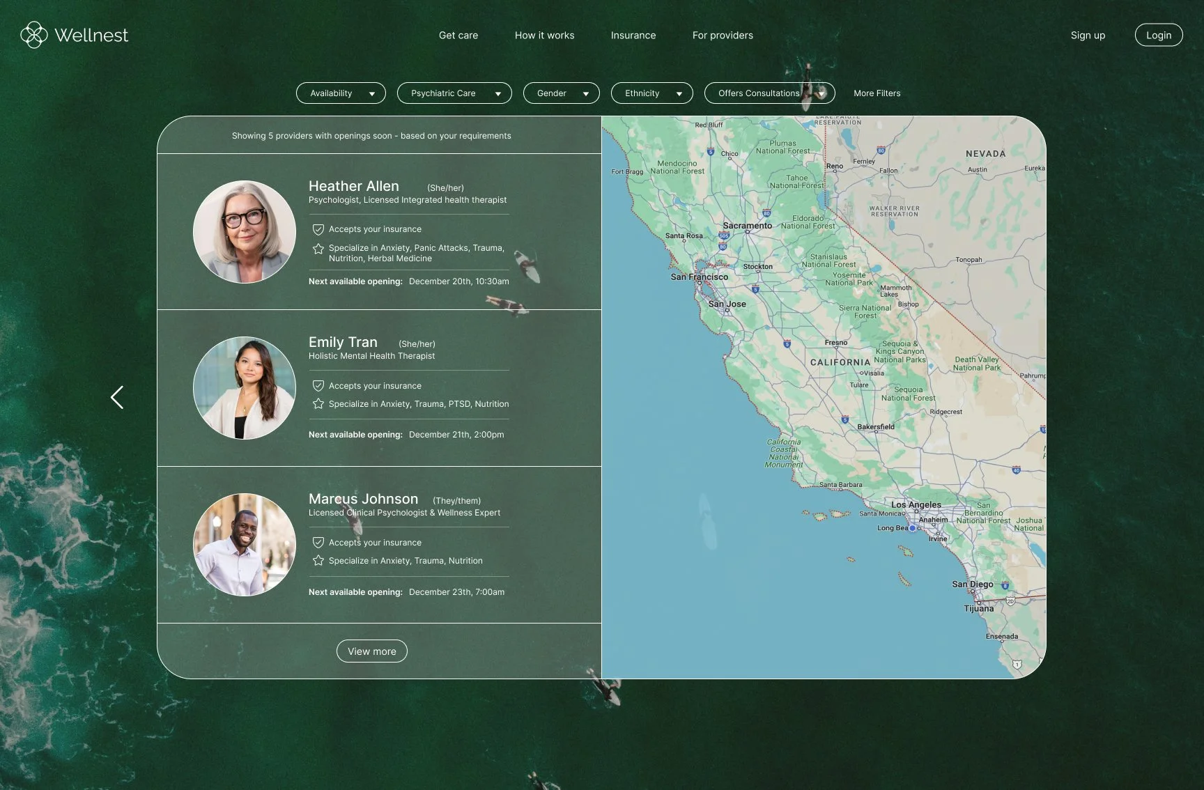
Therapist Search Results
Based on what users share with the chatbot, the search results show therapists that match their needs.
I designed this page to feel manageable rather than overwhelming - there's a map on the right showing where therapists are located, and users can apply additional filters if they want to narrow things down further. The goal was to make browsing feel thoughtful, not stressful.
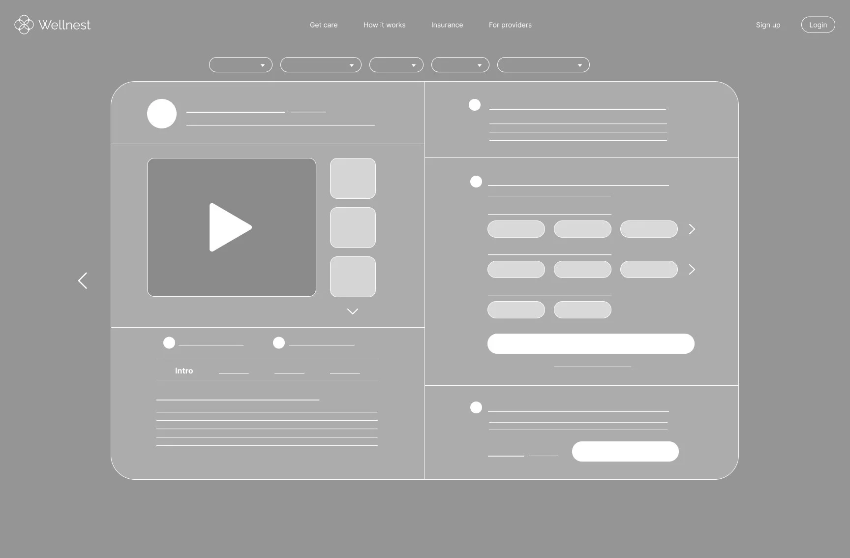
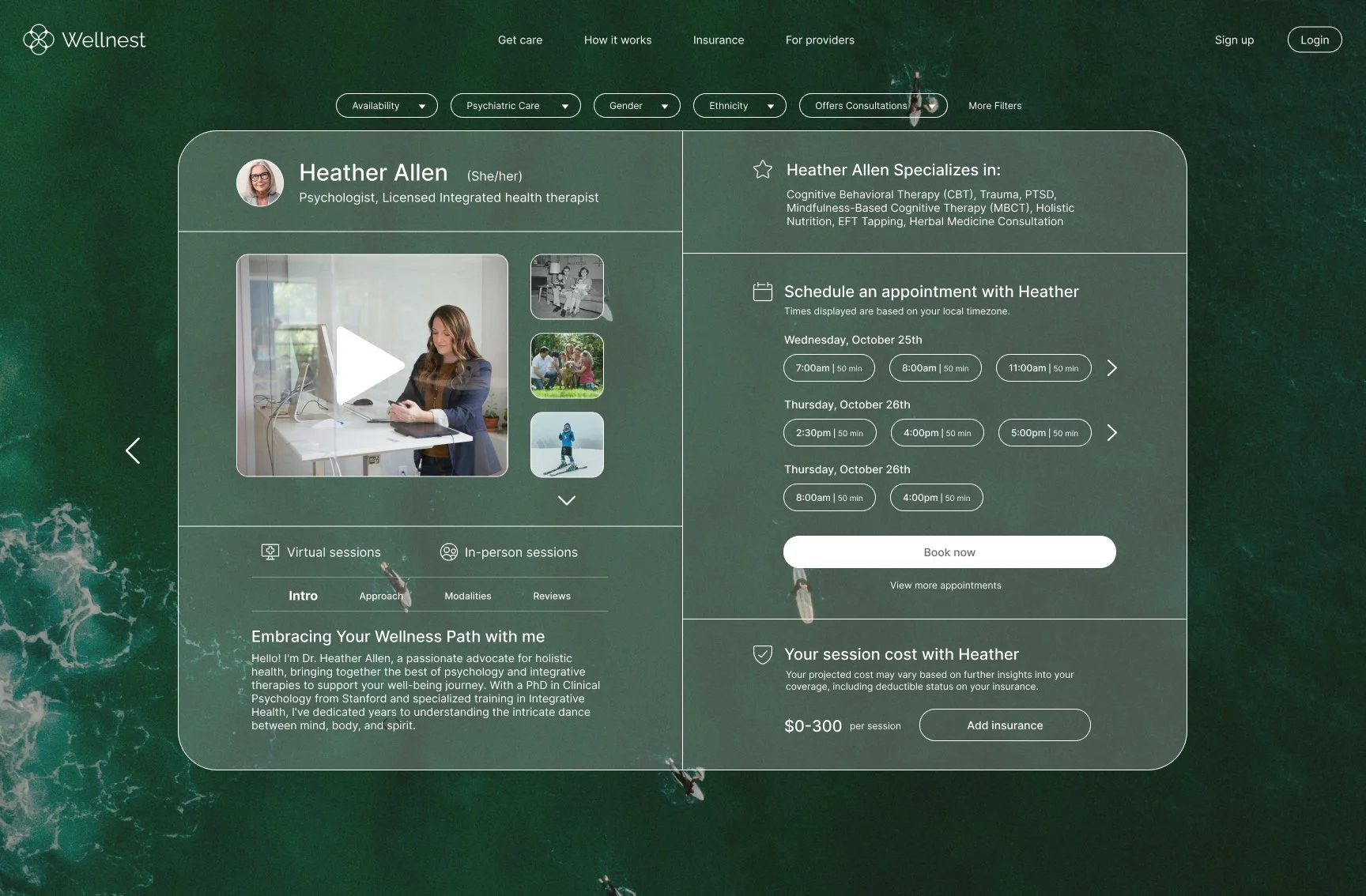
Therapist Profile
I designed therapist profiles to go beyond just listing credentials. Therapists can include videos introducing themselves, photos, their personal values, and details about how they run sessions. The idea was to give users enough information to find someone who actually feels like a good fit, not just someone who looks good on paper.

Account Creation
I placed account creation after users have already explored therapists and found someone they're interested in. This way, people can get a feel for the platform and build some trust before I ask them to sign up. It felt more natural than forcing registration right at the beginning.

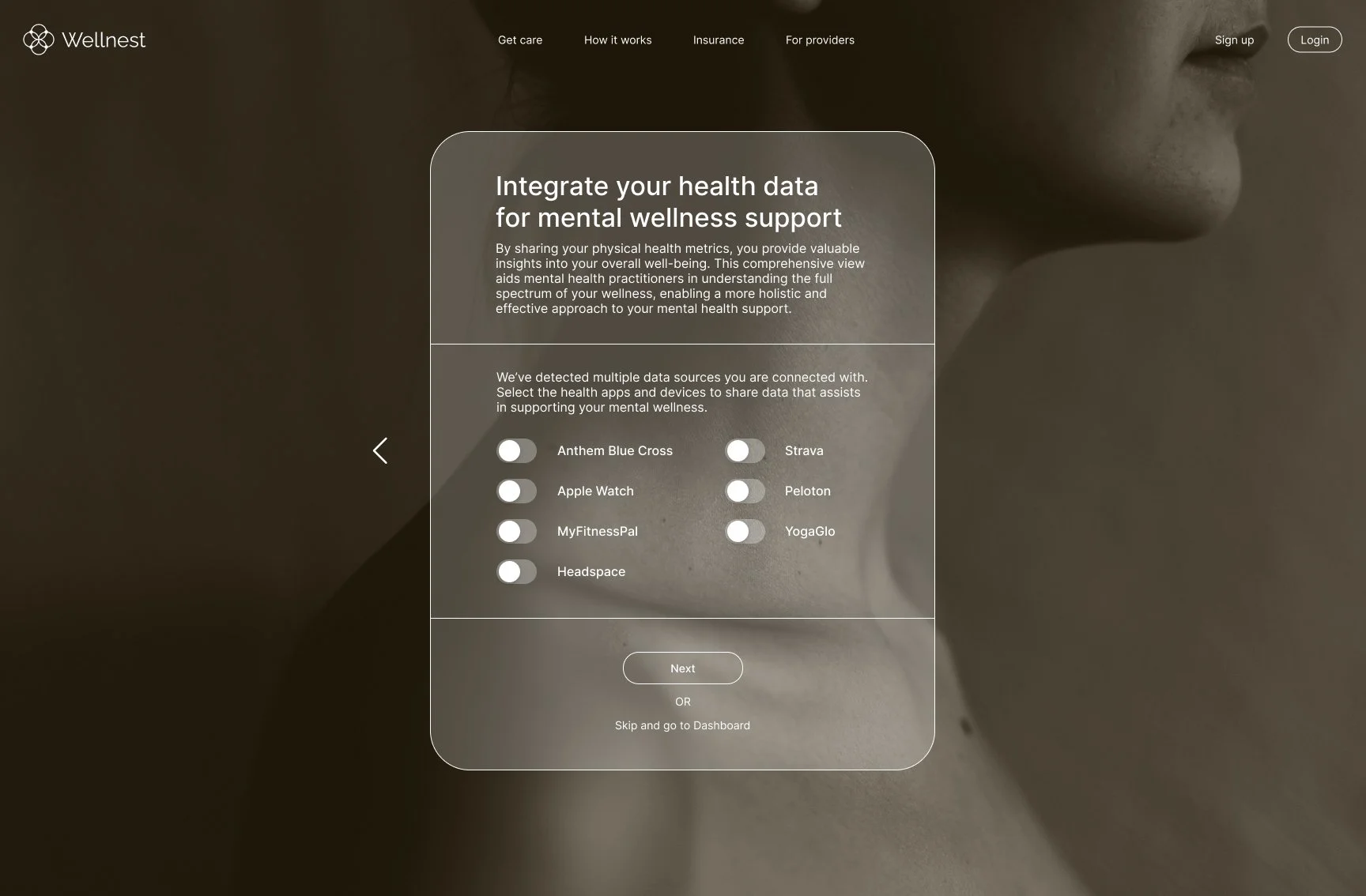
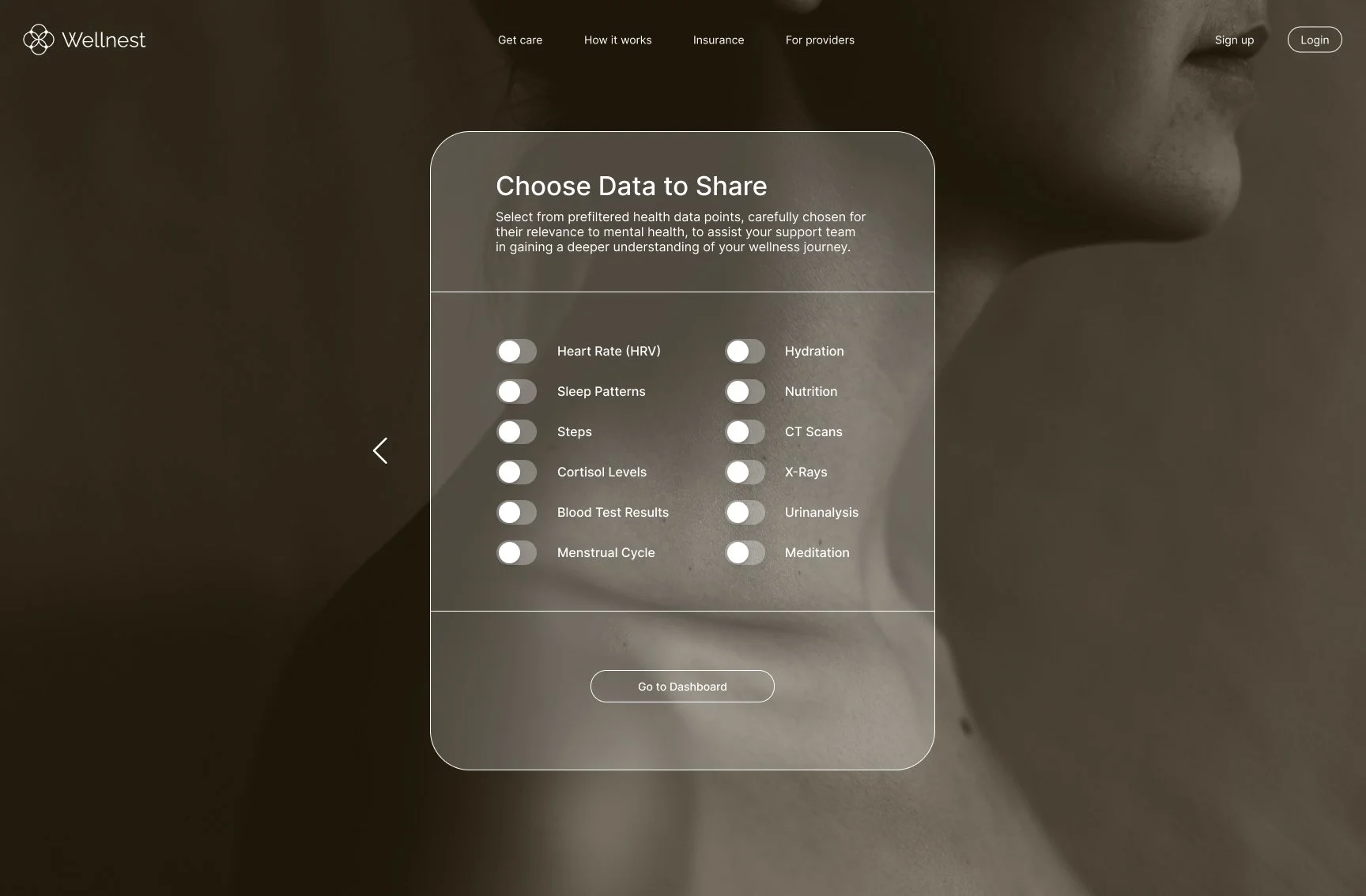
Health Integration
Research showed people wanted their physical and mental health connected, I added a feature to link health apps like Apple Health or MyFitnessPal.
Users stay in complete control of what they share, and they can choose to give their therapist access to things like sleep patterns or activity levels. This gives therapists more context about what might be affecting someone's mental health.
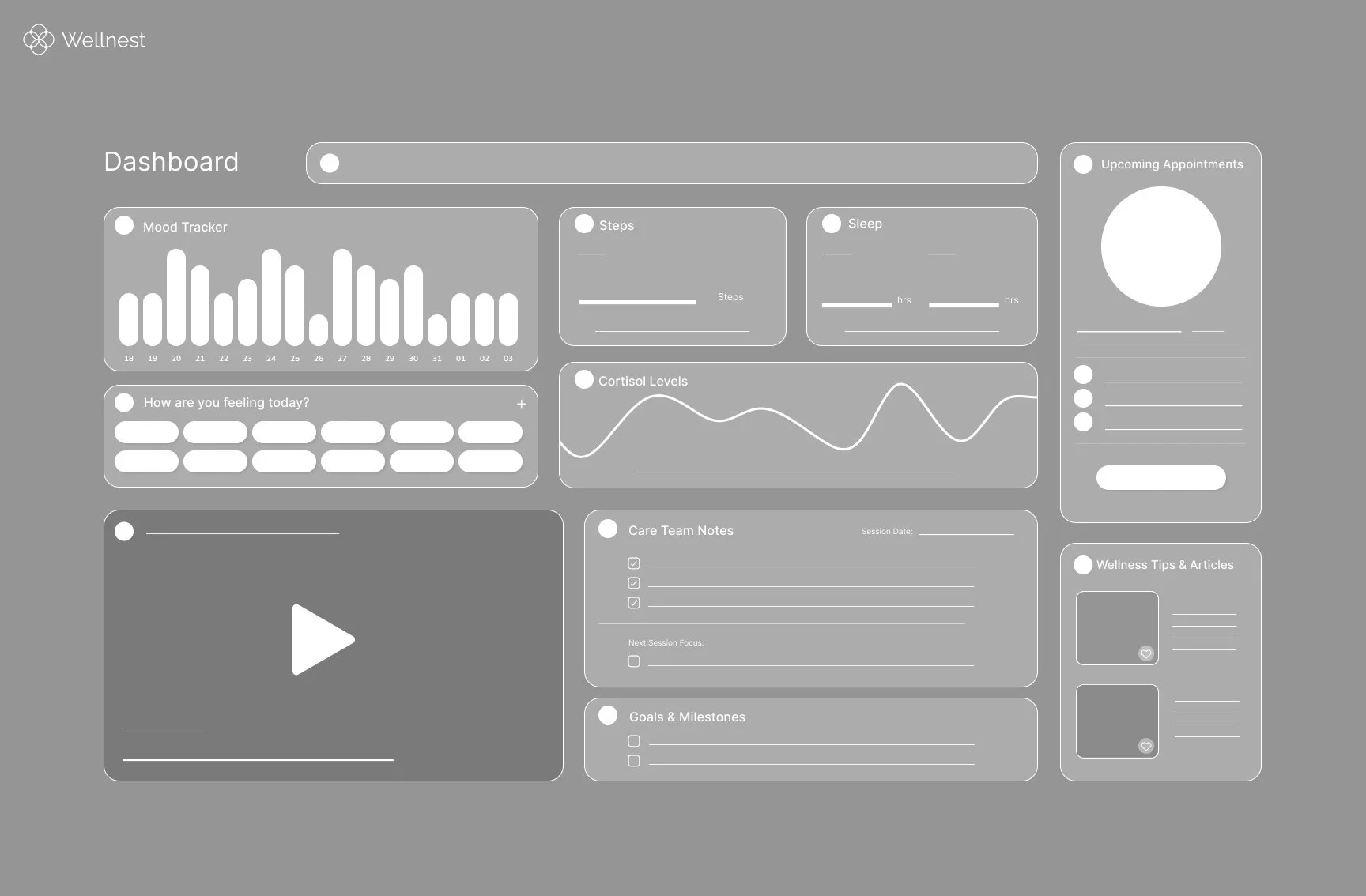
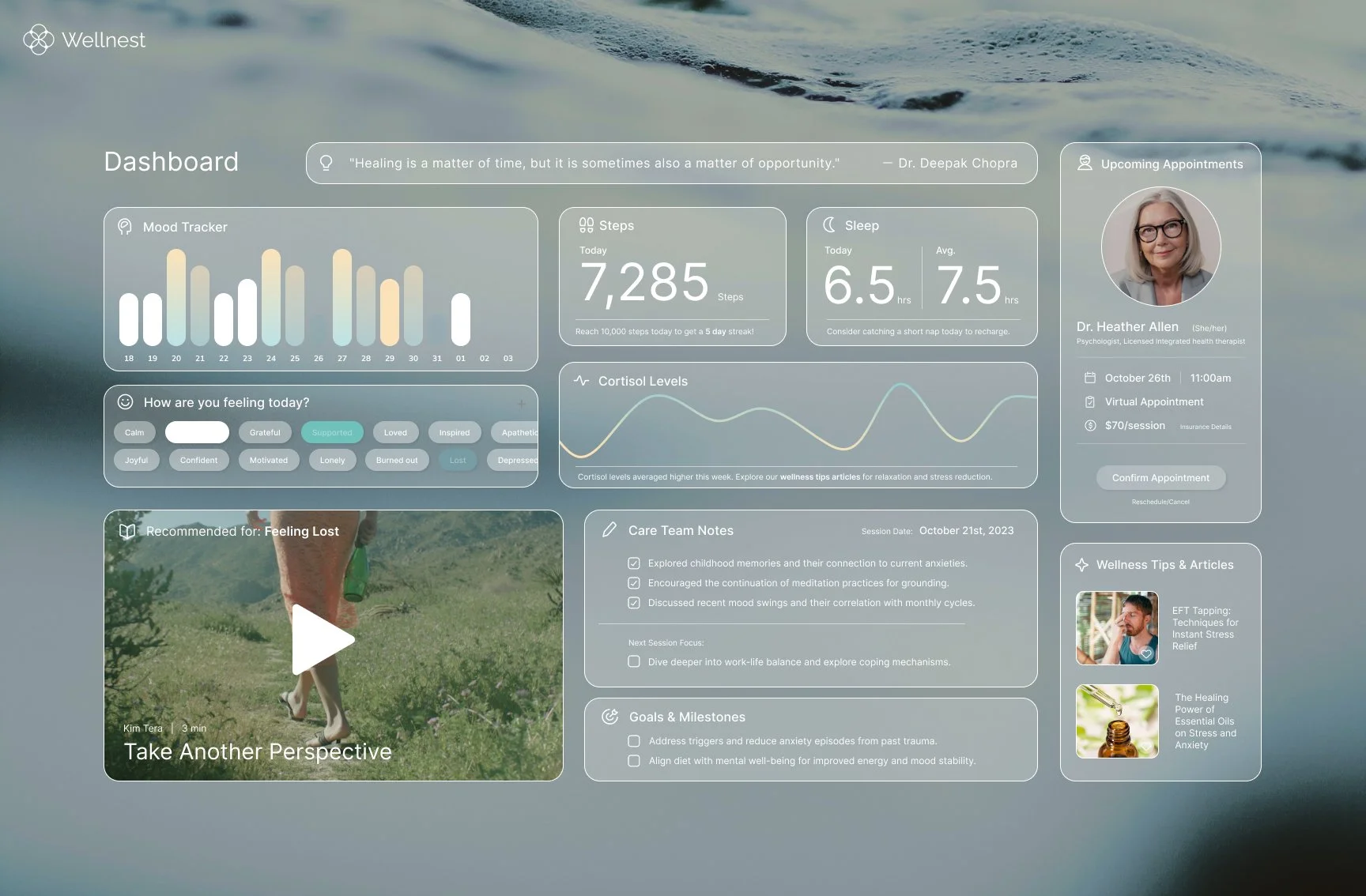
Wellnest Dashboard
The dashboard brings everything together in one place using a card-based layout.
Users see only the information they've chosen to share - things like upcoming appointments, therapy goals, notes from sessions, mood tracking, and health data from their connected apps. I wanted it to feel like a helpful overview, not an overwhelming data dump.
BRANDING & DESIGN SYSTEM
Visual Direction
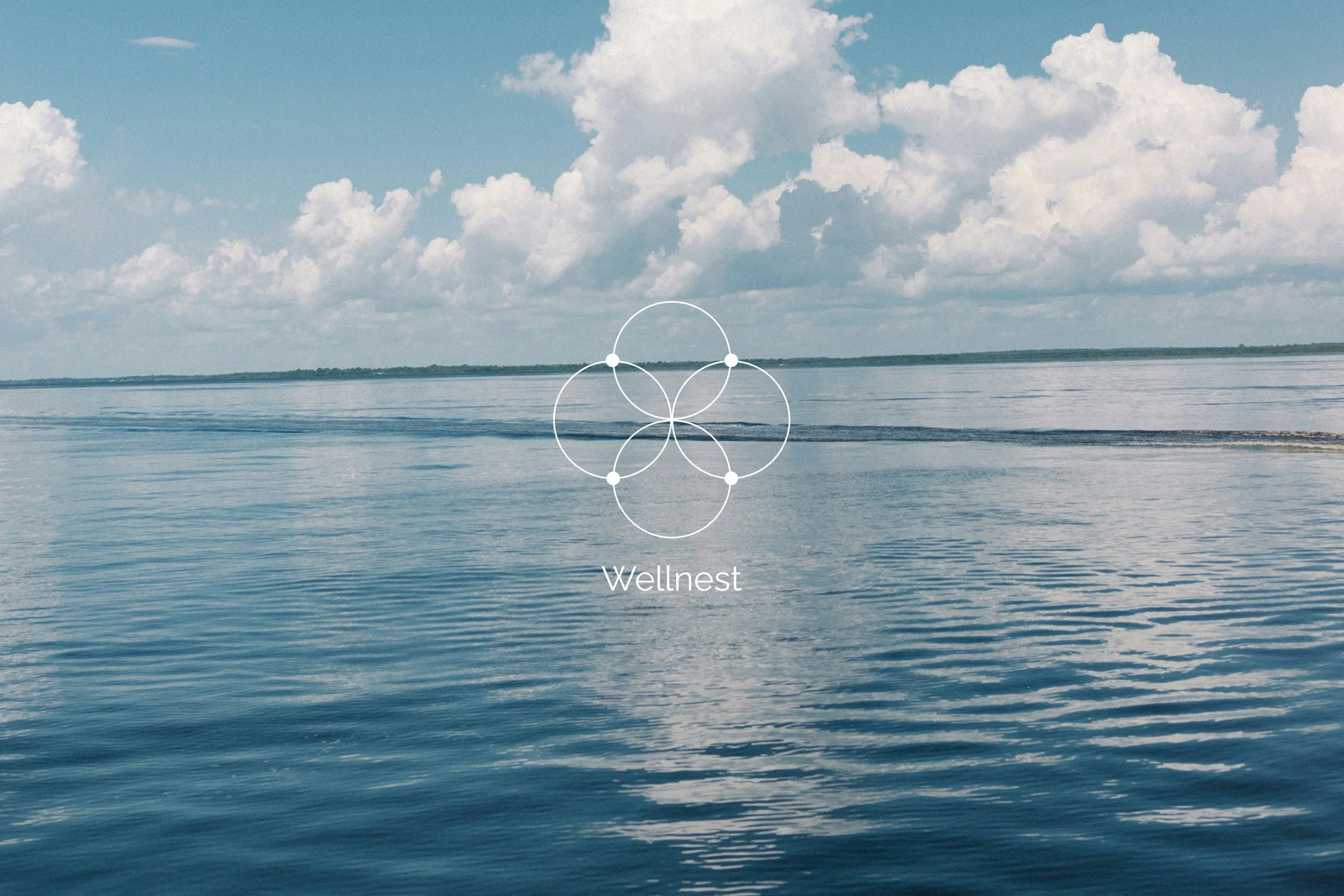
I wanted Wellnest's visual design to feel calm and integrated, reflecting the app's approach to connecting mental and physical health. The aesthetic draws inspiration from nature - organic, interconnected, and soothing.


LOGO Concept
I wanted the logo to visually represent what Wellnest does - bringing together mental and physical wellness. I explored symbols that showed connection and integration rather than separation.
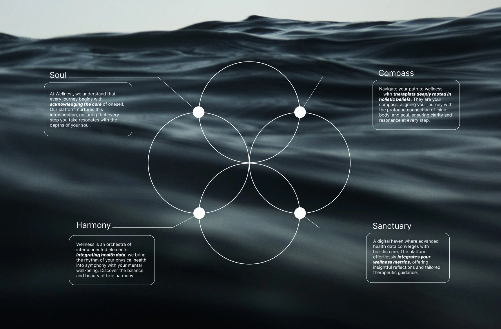
LOGO
The final logo combines a Venn diagram (representing the overlap between mental and physical health) with elements inspired by the Flower of Life pattern (symbolizing interconnectedness and wholeness).

Venn Diagram
+

Flower of Life
=

Wellnest Logo
Color
I built the color system around soft, calming tones with semi-transparent white elements layered over nature-inspired backgrounds. This creates an atmospheric feel that's soothing but still functional - the backgrounds set an emotional tone without making the interface hard to use.


For areas like the dashboard where users need to focus on data, I added selective color highlights to draw attention to important information like progress charts and upcoming appointments.
Typography
I chose Inter as the primary typeface because it's clean, readable, and feels approachable rather than clinical.

The font has enough weight options to create clear hierarchy throughout the app, helping users easily scan information without feeling overwhelmed.
Its open, friendly letterforms support the overall calming experience I was aiming for.
Icons
The icon system for Wellnest is designed to be clear, calm, and emotionally intuitive.
I designed two types of icons for Wellnest. Primary icons handle the main functions - booking appointments, tracking mood, messaging with therapists - and use rounded, simplified shapes that feel gentle rather than sharp or clinical.
Secondary icons cover smaller details like time, session type, and pricing. I kept these more minimal so they provide necessary information without competing for attention.
Components
All the UI components - buttons, toggles, dropdowns, input fields - follow the same rounded, minimal style to keep everything feeling cohesive and calm.
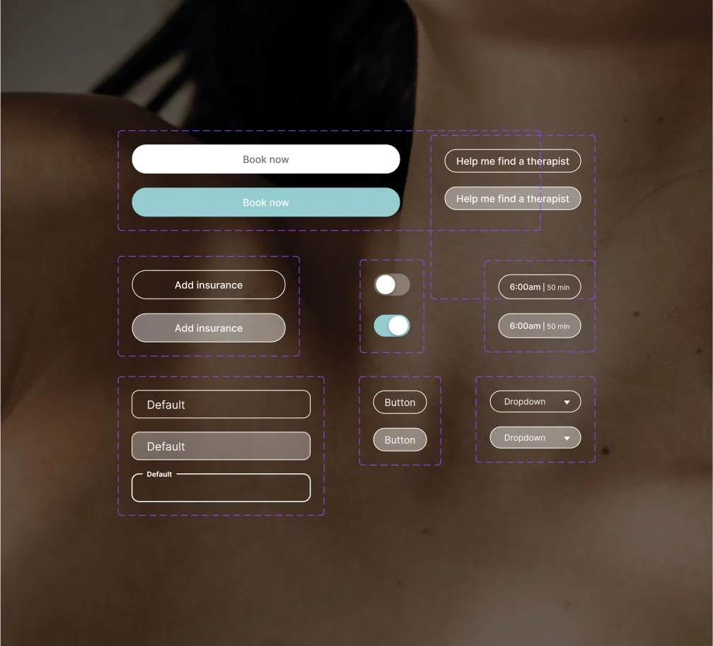
I made sure each element clearly shows when it's active, disabled, or being interacted with through subtle color changes.
For example, toggles smoothly transition colors when switched, and buttons use a soft blue that feels inviting rather than pushy.
FINAL DESIGNS

CONCLUSION
Wellnest came from my own experience navigating therapy and realizing how disconnected the process felt.
Through research and interviews, I learned that other people struggled with the same things - finding the right therapist, feeling overwhelmed by the search process, and wanting care that looked at their whole health picture, not just mental symptoms.
This project pushed me in new ways. I had to think systematically about user flows and information architecture while also creating a visual design that felt trustworthy but not clinical. The biggest challenge was scope - I originally wanted to connect primary care doctors and therapists directly, but realized that was too complex for an MVP. Focusing on health data integration instead let me keep the holistic approach while building something actually feasible.
Working on Wellnest let me combine different skills - UX research, interface design, and brand thinking - to create something that addresses a real gap in mental health support.