

MOOI SPACE
A lifestyle brand for people who want less, but better.
I spent four years building Mooi Space with Tydus Inc., a sustainability brand that proves eco-friendly doesn't have to mean boring. We focused on quiet design, natural materials, and the kind of products you actually want to keep around.
The whole idea came from a simple belief: you only stick with sustainable choices when they make you feel good. So everything we made had to work beautifully and feel right in your hands.
Company: Mooi Space by Tydus Inc.
Role: Art Direction, Brand Identity, Product Development & Design
Time Period: 2019 - 2023
Navigation
Trend & Product Direction
I spent a lot of time researching how people's lifestyles were shifting.
Especially the move toward slower, more intentional living.
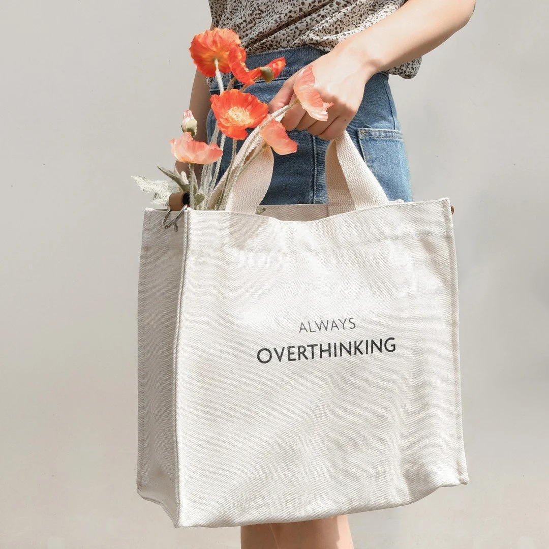
The products I developed weren't just about looking minimal. They were about feeling calm, emotionally connected. Think soft textures, muted colors, and shapes that don't demand attention but make your space feel more peaceful.
Every product had to pass the "would I actually use this every day?" test.


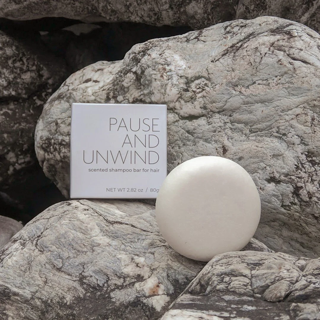
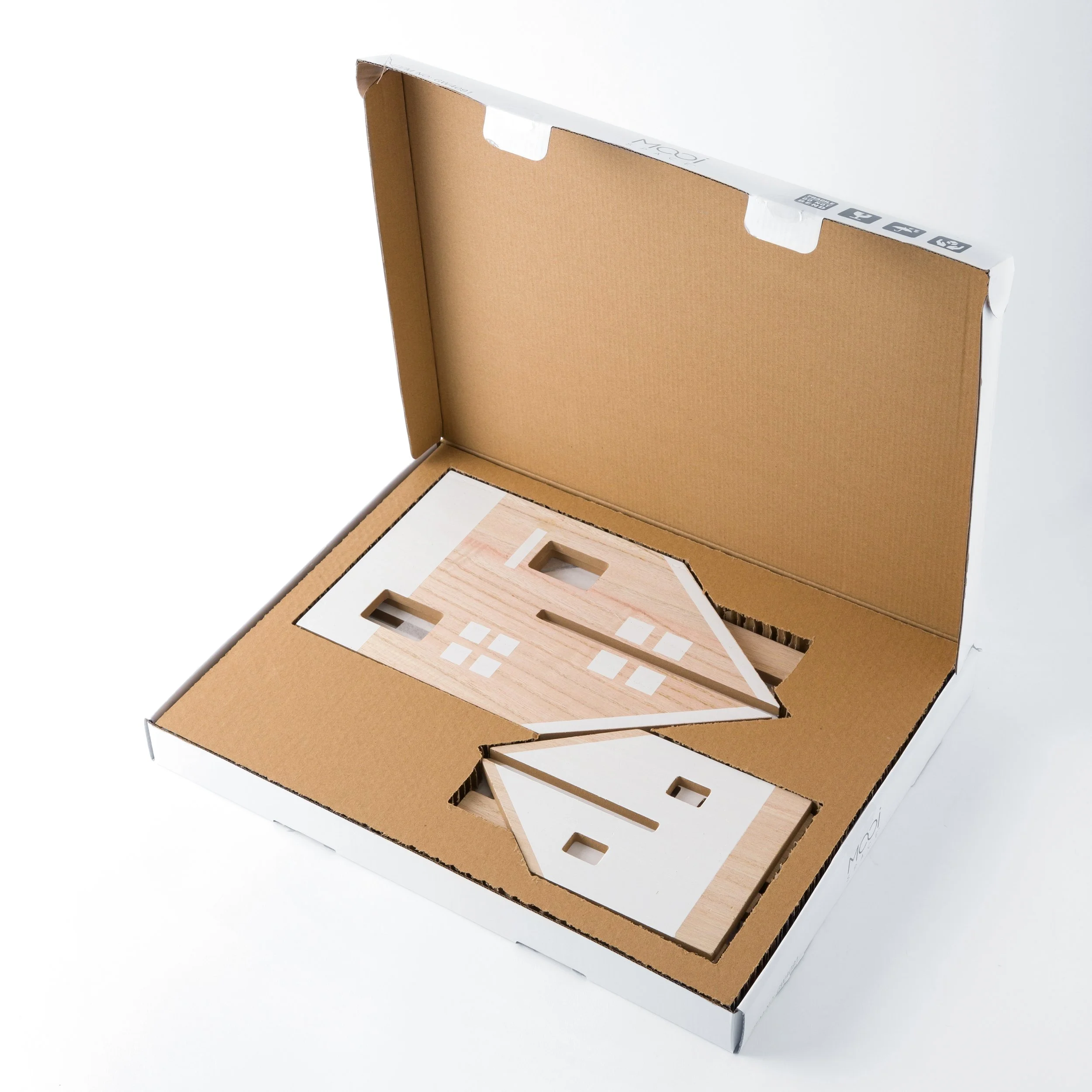
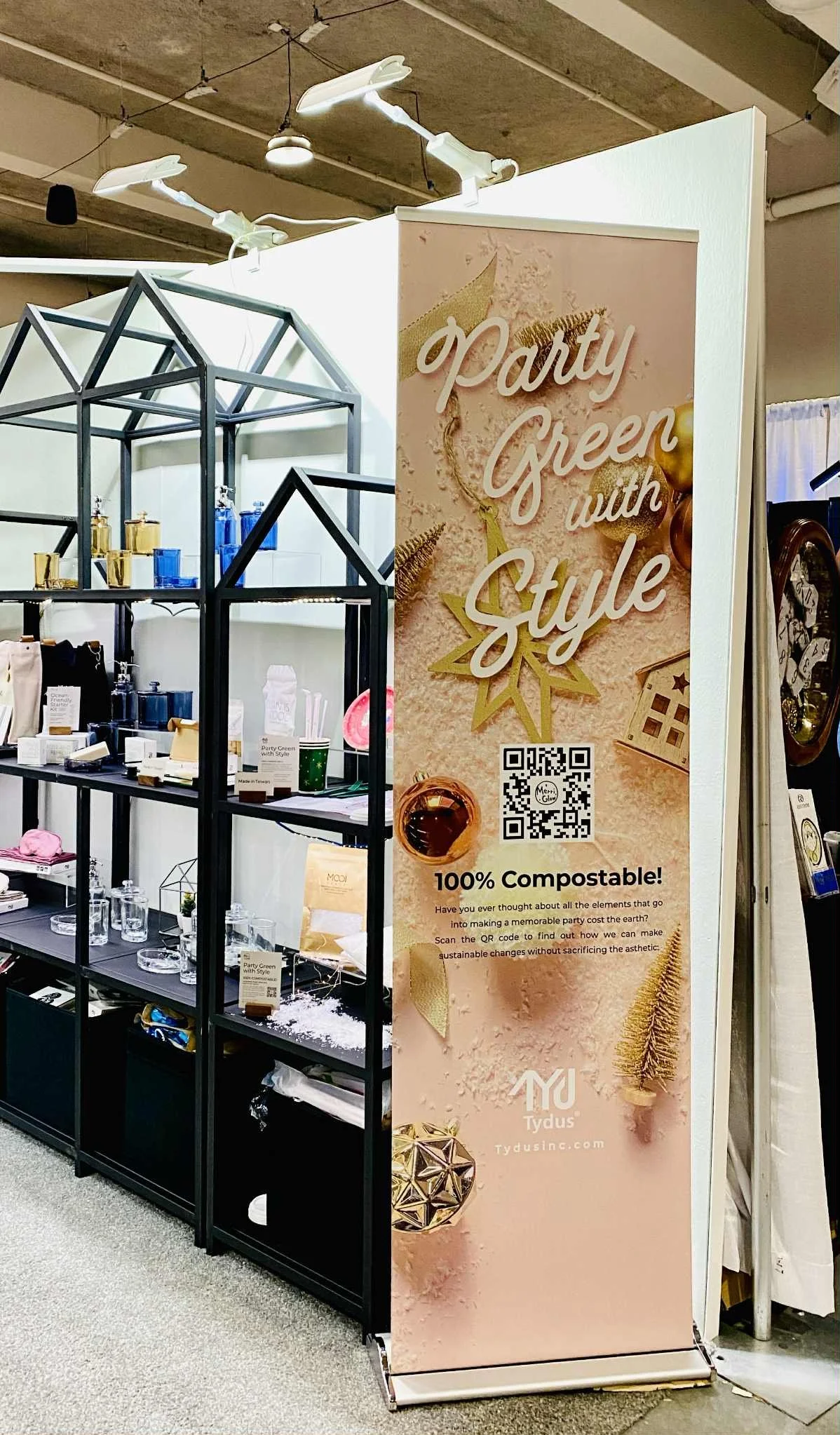
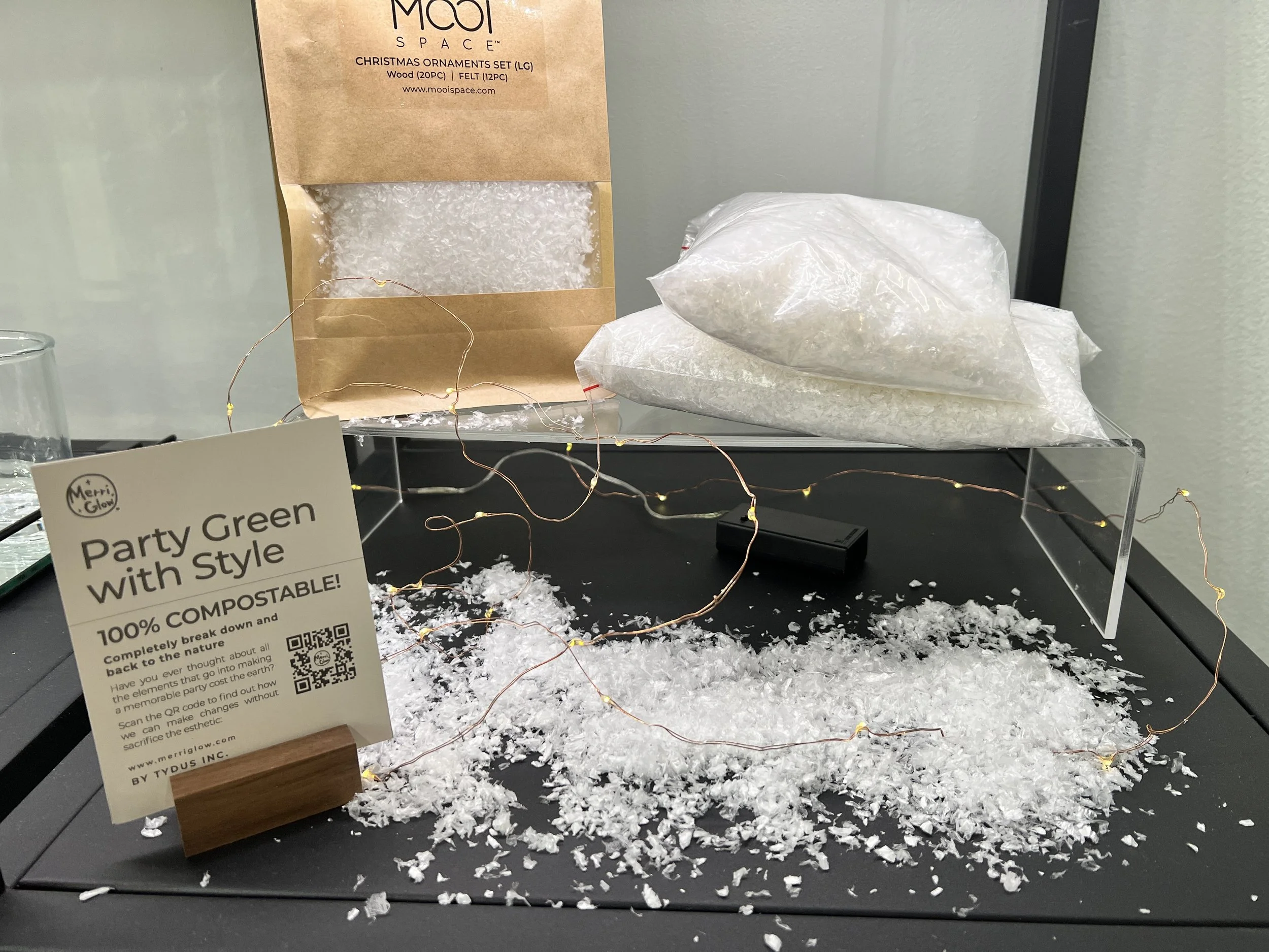
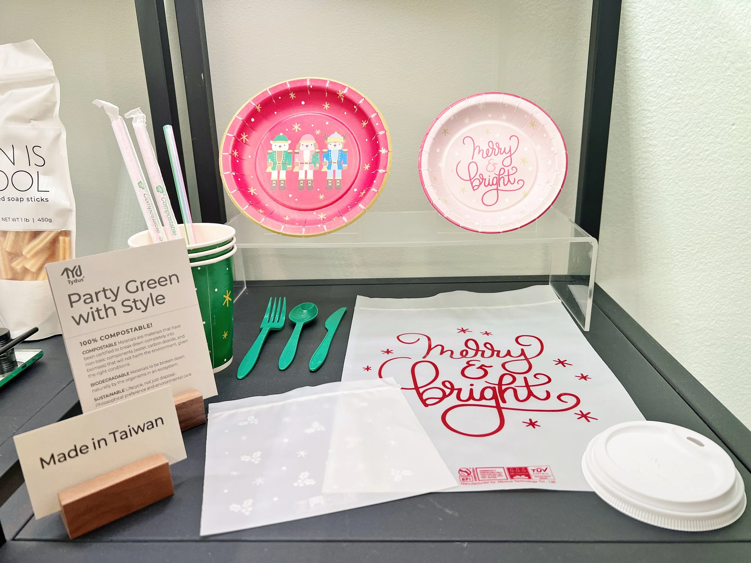
Packaging
Packaging was tricky because it had to work hard in retail while staying true to our "less is more" philosophy.
I used recycled materials, kept ink usage minimal, and chose typography that felt quiet but confident. The goal was for someone to pick up a box and immediately understand what Mooi Space was about, even before they read a word.


Photography
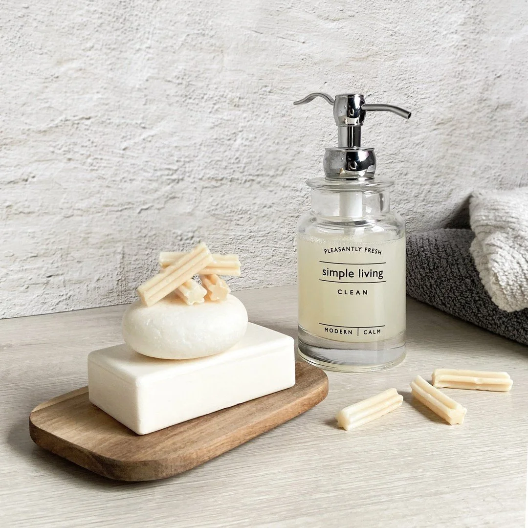
I treated photography like visual storytelling. Instead of sterile product shots, I created scenes that showed how these products actually live in someone's day.
Soft, natural lighting. Real textures. Arrangements that felt lived-in, not staged. The photos had to make people think "I want that feeling in my life," not just "I want that product."


Website

The website needed to feel like the physical products: Calm, uncluttered, and easy to navigate.
I kept the interface minimal so the products could speak for themselves. Clean layouts, plenty of white space, and an experience that felt intentional rather than overwhelming.
Customer Information Design
Getting the information design right was crucial because sustainable products often need more explanation than conventional ones.
The packaging inserts, labels, and retail displays that educated without lecturing. The key was making information feel helpful rather than preachy. Showing people why our materials mattered without making them feel guilty about their other choices.


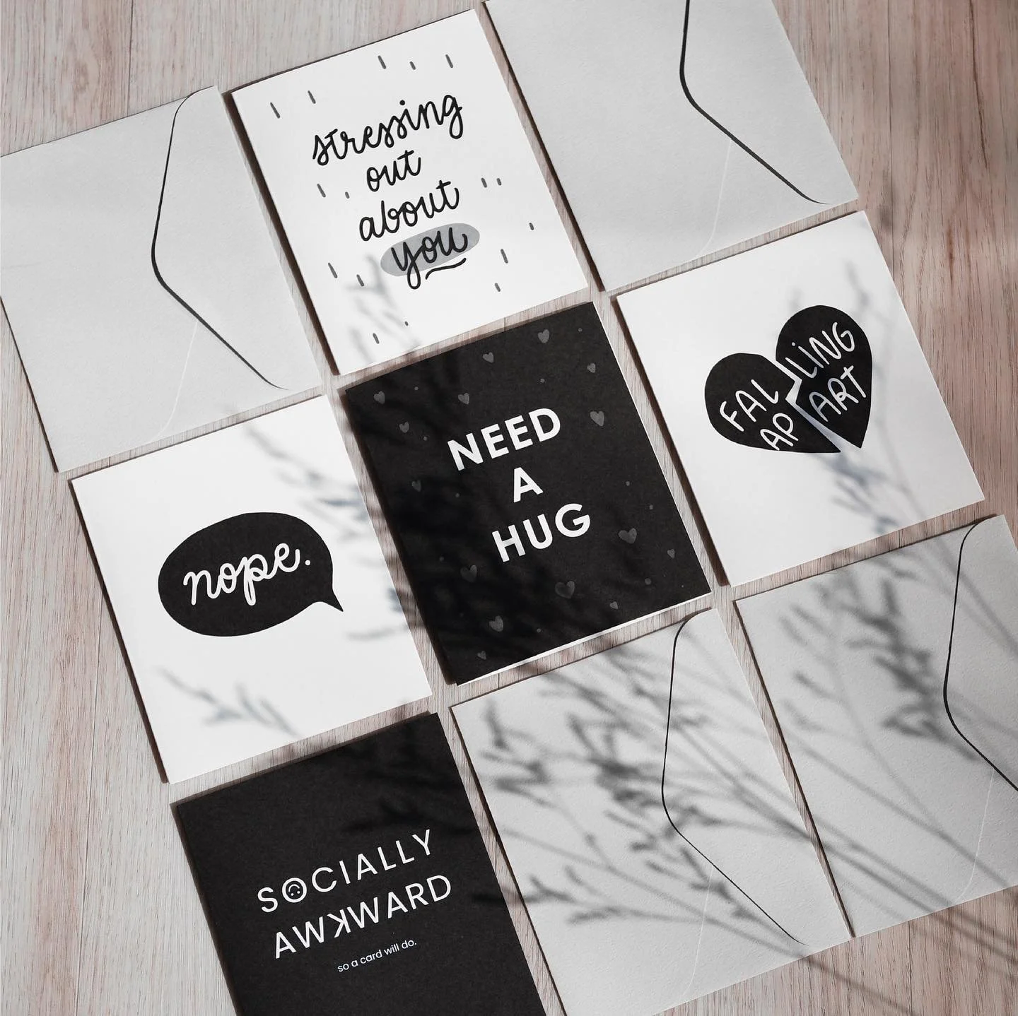
Social Media
Social media was about bringing the brand's calm energy into digital spaces.
Instead of aggressive selling, I focused on sharing the process, the why behind our choices, and how the products fit into real life. The content had to feel as peaceful and intentional as everything else we made.
The goal was to make scrolling through our feed feel like a little mental break.
Soap Sticks
Shampoo Bar